
Figure 3.
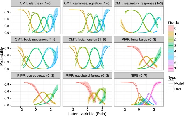
Item‐grade probability curves. X‐axis is the latent variable and Y‐axis represents the probability of each grade occurring. Each color represents a specific grade, between 0 and 7. Solid lines are predictions from the graded response model and dashed lines with shaded areas are a smoothed mean and 95% confidence interval for the raw data. For COMFORT (abbreviated as CMT), colors representing grades from 1–5 are present, for Neonatal Infant Pain Scale (NIPS) color representing grades from 0–7 are present, and for preterm infant pain profile (PIPP) colors representing grades from 0–3 are present, according to the discrimination and difficulty values of the grades of these items.