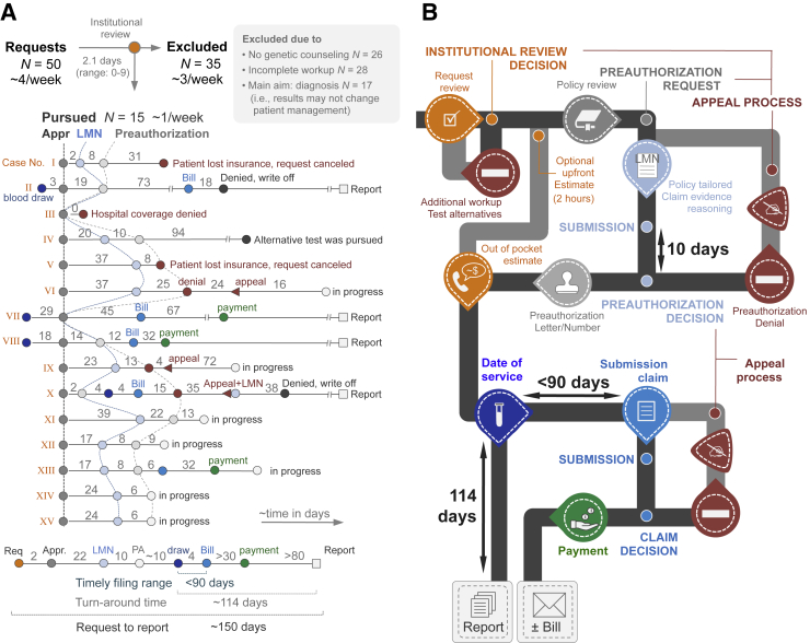
Figure 3.
Data from the pilot phase (A) and workflow infographics (B). Institutional review and cost estimation (orange) resulted in 35 rejections (selected exclusion criteria provided in gray box in panel A). The 15 pursued requests (labeled I to XV) are provided as line-dot plots providing cadence and timing of events. As a result of an unprepared delivery system and heterogeneity among payors, the process had to remain flexible and we tested 12 different combinations of modules. Connection lines between Letters of Medical Necessity and preauthorizations (hatched lines) are used to visualize the variability in timing between patients. The summary line-plot at the bottom of the panel illustrates the extension of the technical (laboratory) turnaround time by the addition of the preauthorization process. Based on this summary plot and the various possibilities (eg, preauthorization denial or reimbursement denials), we constructed the infographics (B). The colors correspond to those provided in panel A and fixed times (payor processing and test turnaround times) are provided. The typical cadence of modules is shown in black, optional and case-based pathways are shown in gray (eg, appeal process). Payment refers to reimbursement by insurance; Bill refers to a bill sent to the patient. Appr., approval; LMN, Letter of Medical Necessity; PA, preauthorization; Req, request.

