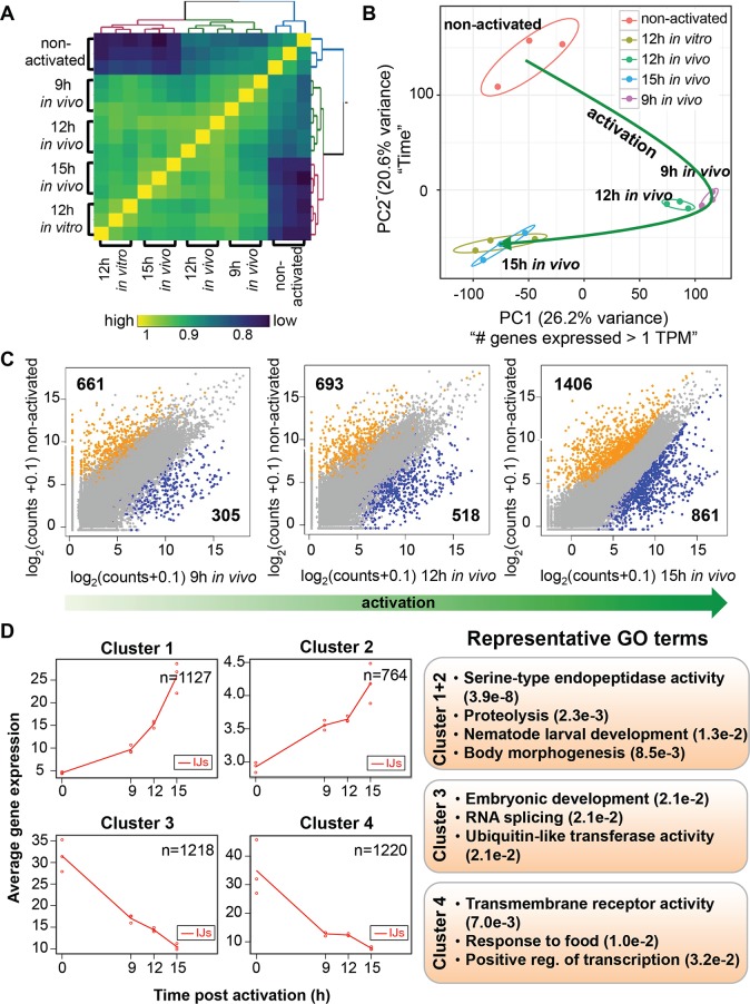
Fig 3. Gene expression dynamics during in vivo IJ activation.
(A) Gene expression correlation matrix comparing the Spearman’s rank correlation coefficients between activated and non-activated IJs. Yellow colored cells indicate high correlations while blue cells indicate low correlations. Gene expression was transformed (log2(counts+1)) prior to calculating the correlation coefficients. Samples were K-means clustered by their Spearman’s rank correlation coefficients. (B) Activated and non-activated IJ transcriptomes plotted in the space of the first two principal components (which comprises 46% of the variation). A short description of what each principal component (PC) explains is included next to the PCs. The green line show the trajectory of IJ activation. (C) Scatterplots comparing the expression of all genes between non-activated IJs and 9 hr, 12 hr, 15 hr in vivo activated IJs. Genes labeled in orange and blue are differentially expressed (FDR < 0.05 and fold change > 2) between the stages compared, while grey genes are not. Expression for each gene was averaged across the biological replicates. (D) maSigPro plots showing the average expression of clusters of genes that are differentially expressed over the in vivo activation time course. The GO terms are representative of these expression clusters.

