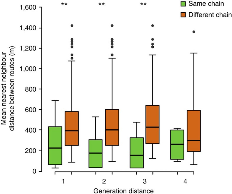
Figure 3. Route similarities within and between chains of generations in the experimental group.
Mean nearest-neighbour distances (see Methods) are plotted between flights within the same chain and between different chains in the experimental group, at all possible generation distances (that is, differences in ordinal generation numbers). Larger values indicate lower route similarities. Each box extends between the lower and upper quartiles, the horizontal line within the box corresponds to the median and whiskers show the range of the data, except for outliers indicated by circles. Mann–Whitney–Wilcoxon test: **P<0.01.

