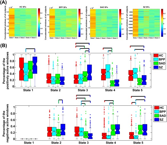
Figure 7.

(A) Values of SFs in the concatenated windows of all subjects for each state. (B) The percentage of the positively and negatively active windows of each state. The percentages from different subjects in the same group are shown using a boxplot. For each boxplot, the central line is the median; the square is the mean; and the edges of the box are the 25th and 75th percentiles. The whiskers extend to 1 inter‐quartile range, and the outliers are displayed with a “*” sign. Any pair of groups with significant group difference tested by two‐sample t‐tests (P < 0.05 with Bonferroni correction) is denoted by a line. For State 4 of SZ and State 5 of SAD, we do not display their comparison results with the associated states from other groups, due to that they showed unique connectivity patterns. State corresponds to GS in Figure 4. [Color figure can be viewed at http://wileyonlinelibrary.com]
