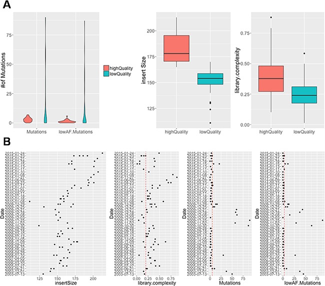
Figure 3. The association of DNA quality and total mutational load among all samples.

(A) Violin plot in left panel show the number of selected mutations and selected low AF mutations between high-quality and low-quality samples. Boxplot in right panel show the insert size and library complexity between high-quality and low-quality samples. (B) Correlation between sample collection date and insert size, library complexity, number of mutations, number of low AF mutations illustrated by scatterplot
