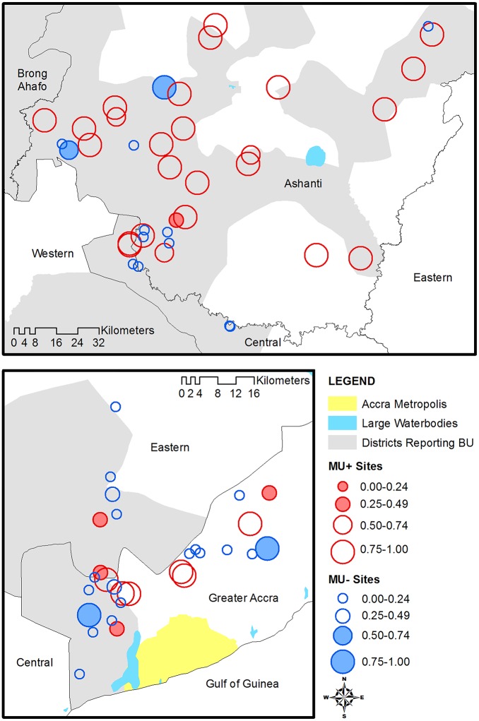
Fig 7. Map of the predicted probability of M. ulcerans positive based on the best fitting model.
Blue circles represent sites that were actually M. ulcerans negative and red circles M. ulcerans positive. The size of the circle indicates the predicted probability of M. ulcerans positive, and shaded circles indicate poor fit (MU+ sites with low predicted probability or MU- sites with high predicted probability).

