
Fig. 7.—
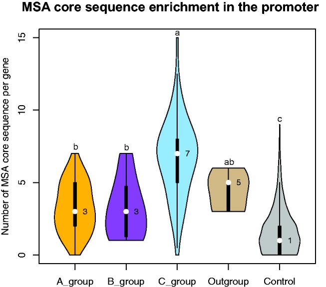
Violin plots of the number of MSA core sequences in the upstream regions for each group of genes. The median number of MSA core sequences in each group is shown by the white dot (the median is on the right side). Kernel width indicates the fitted data density under kernel distribution. a, b and c above each violin plot indicate difference significance by ANOVA and Tukey’s HSD test under 0.05 significance.