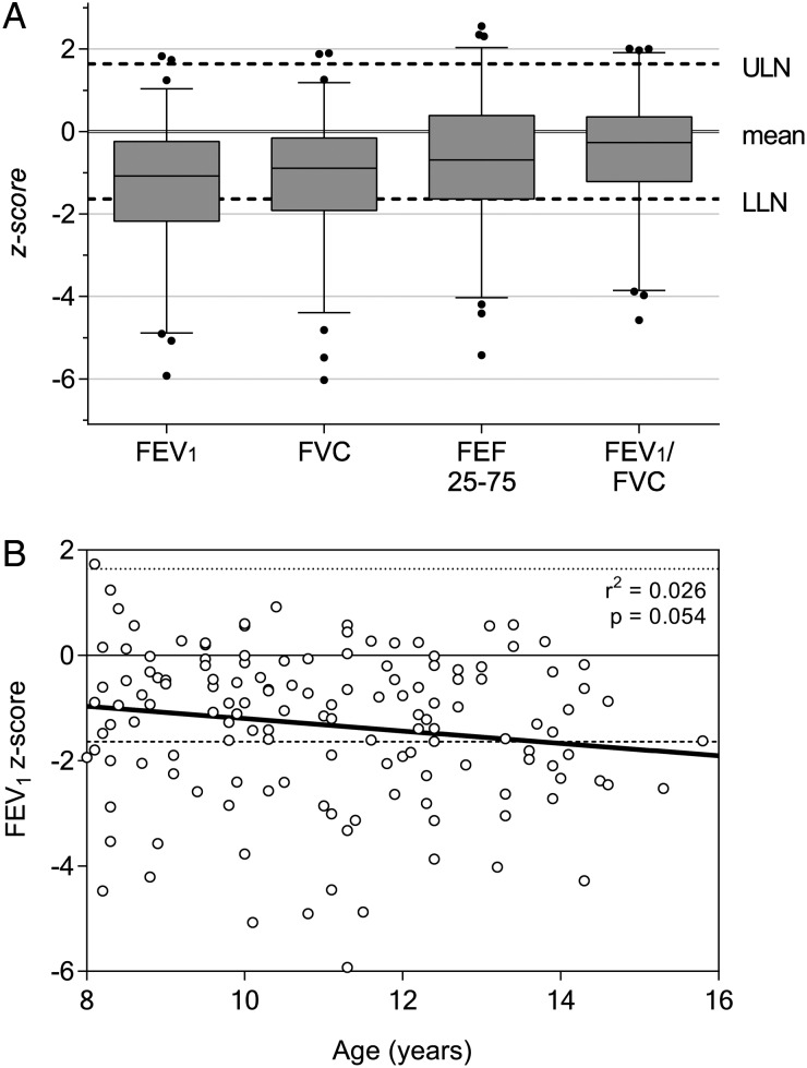
Figure 2.
Spirometry results overview. Graphs illustrating the degree and distribution of spirometric abnormality. (A) Boxes represent 25th and 75th percentiles, whiskers represent 10th and 90th percentiles, with outliers shown as individual dots. Upper limit of normal (ULN) and lower limit of normal (LLN) drawn by dashed line at +1.64 standard deviation (SD) and −1.64 SD from the mean, respectively. (B) Forced expiratory volume (FEV1) z-score for all participants as a function of age. Linear regression model is shown as a solid line. There is a nonsignificant tendency to reducing FEV1 with increasing age in this cohort (r2 = 0.026; P = .054). Similar results for forced vital capacity obtained (results not shown).

