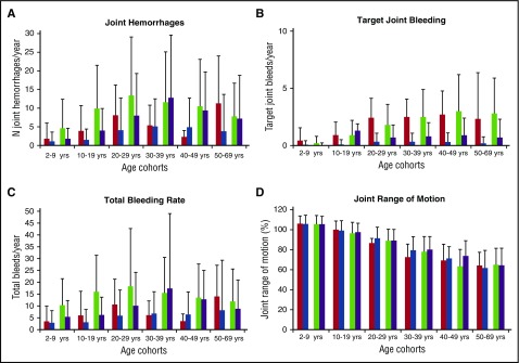
Figure 3.
Cross-sectional analyses: mean changes in bleeding rates and joint range of motion from 1999 to 2010. (A-D) Shows changes in outcome rates from 1999 to 2010 stratified by age cohort and prophylaxis usage. (A) Rates of joint hemorrhages; (B) rates of target joints; (C) total bleeding rates; and (D) percentage of normal joint ROM in participants. Patients on prophylaxis in 1999 (red); patients on prophylaxis in 2010 (blue); patients not on prophylaxis in 1999 (green); and patients not on prophylaxis in 2010 (purple).

