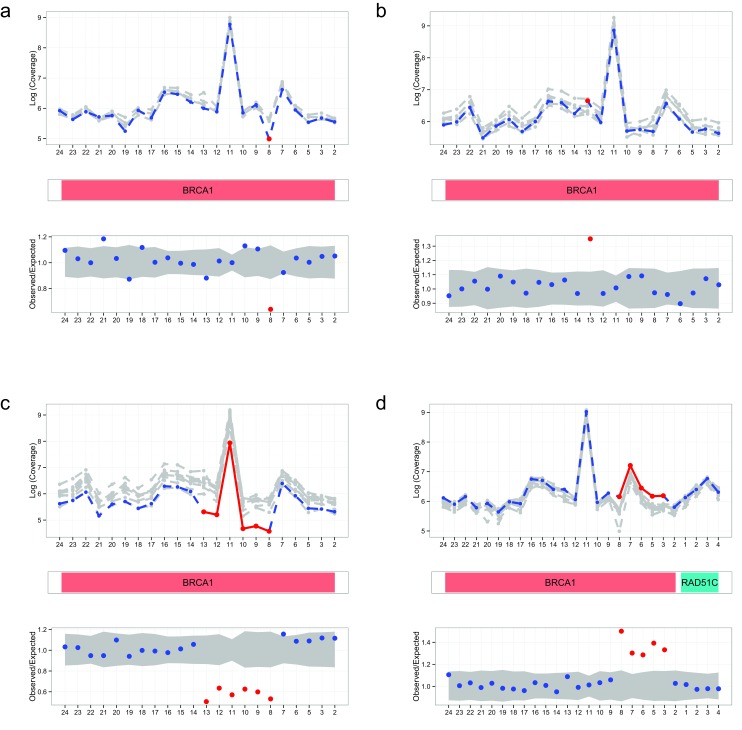
Figure 1. Automated visualisations from DECoN.
In all panels, the top plot shows the log-normalised coverage of the sample of interest (blue) relative to reference samples (grey) and the bottom plot shows the ratio of observed to expected coverage with a 95% confidence interval in grey. The relevant gene(s) are shown between the plots in red. Deleted or duplicated exons called by DECoN are in red. ( a) A single exon deletion; ( b) A single exon duplication; ( c) A multi-exon deletion; ( d) A multi-exon duplication.

