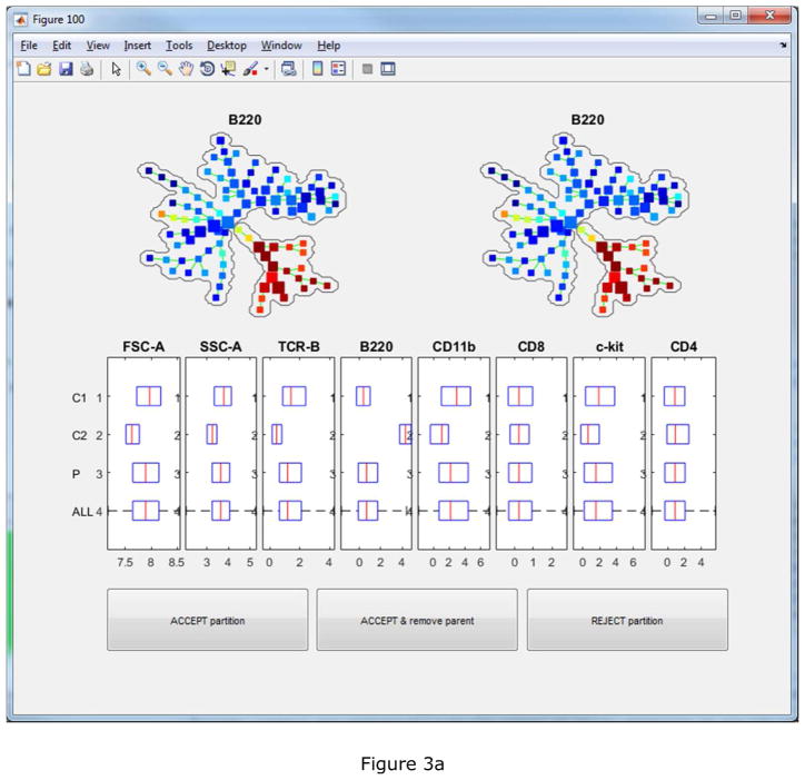
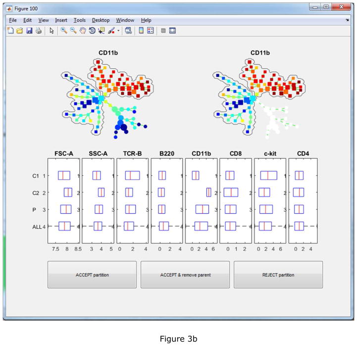
Figure 3.
The first two automated partitioning suggestions. Boxplots show which markers support the suggested partitioning. Bubbles are drawn to visualize the partitioning. The tree is colored by the marker that contributes the most to the suggestion. In the upper-left tree, all nodes are colored. In the upper-right tree, only nodes involved in the suggested partitioning are colored.


