Fig. 1.
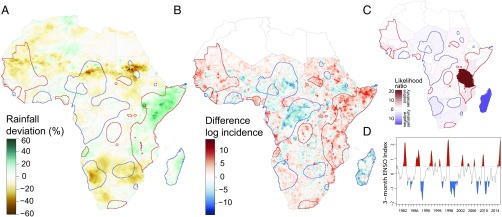
Geographical distribution of cholera in El Niño and non-El Niño years. (A) Rainfall anomalies in El Niño years, 1980–2015. (B) Fine-scale geographic distribution of cholera anomalies in El Niño years, 2000–2014. (C) Country-level cholera anomalies in El Niño years, based on WHO reports, 1980–2015. The colors represent the likelihood ratio in support of a significant difference in cholera incidence between El Niño and non-El Niño years. (D) History of strength of ENSO anomalies, 1980–2015. El Niño years are in red, and La Niña years are in blue. Red and blue outlines in A–C represent regions with positive (red) and negative (blue) sensitivity to El Niño events in cholera incidence selected by smoothing the normalized difference in cholera incidence using a kernel smoothing algorithm with a bandwidth of 150 km and then clustering areas into areas where cholera incidence is positively sensitive, negatively sensitive, and insensitive to El Niño events (Fig. 2).

