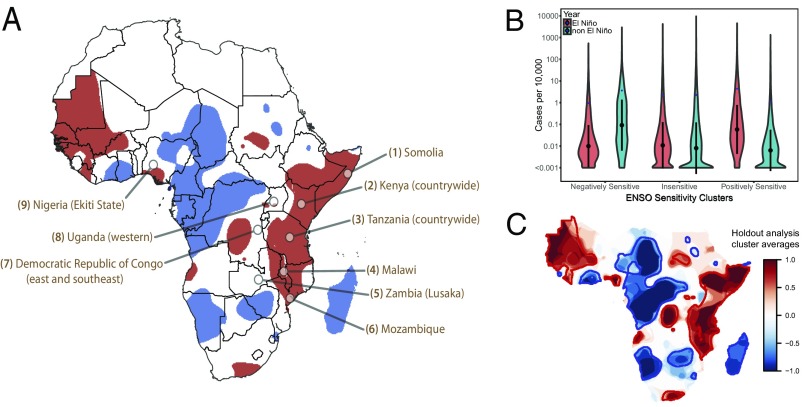
Fig. 2.
Geographical distribution and incidence rates for El Niño-sensitive regions. (A) Regions with positive (red) and negative (blue) sensitivity to El Niño events in cholera incidence. Areas selected by smoothing the normalized difference in cholera incidence using a kernel smoothing algorithm with a bandwidth of 150 km, then clustering areas into areas where cholera incidence is positively sensitive (red), negatively sensitive (blue) and insensitive (white) to El Niño events. Callouts indicate major reported outbreaks of the 2015–16 cholera season (SI Appendix, 1. SI Materials and Methods). (B) Kernel density (violin) plot of cases per 10,000 in different El Niño-sensitive regions during El Niño and non-El Niño years. Black circles are grid cell-level medians ± 1 SD and blue diamonds are grid-cell level means. (C) Overlay of El Niño sensitive clusters from holding out each El Niño or non-El Niño pair of years with negatively sensitive clusters = −1 (blue) and positively sensitive clusters = 1 (red).

