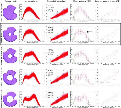
Fig. S8.
Relation between occupiable volume (protein density) and distance distribution. (Left column) Examples of a mask with volume reduction. (Second from Left column) All plots from 1,000 times simulation (red). (Middle column) Zoomed area indicated by green dashed lines in second from Left column. Inset indicates P values at the first three bins. (Second from Right column) Mean and error bar of SD (red). Error bars of SD indicate ±3σ range. Blue lines in histograms are measured distances. (Right column) Zoomed area indicated by green dashed lines in second from Right column. Mask reduction rate in each row is 0, 6, 10, 20, and 30% from Top to Bottom, respectively. Black arrow indicates the best match between measured and simulated distances. Black frame indicates the mask reduction rate that is used for further analysis.

