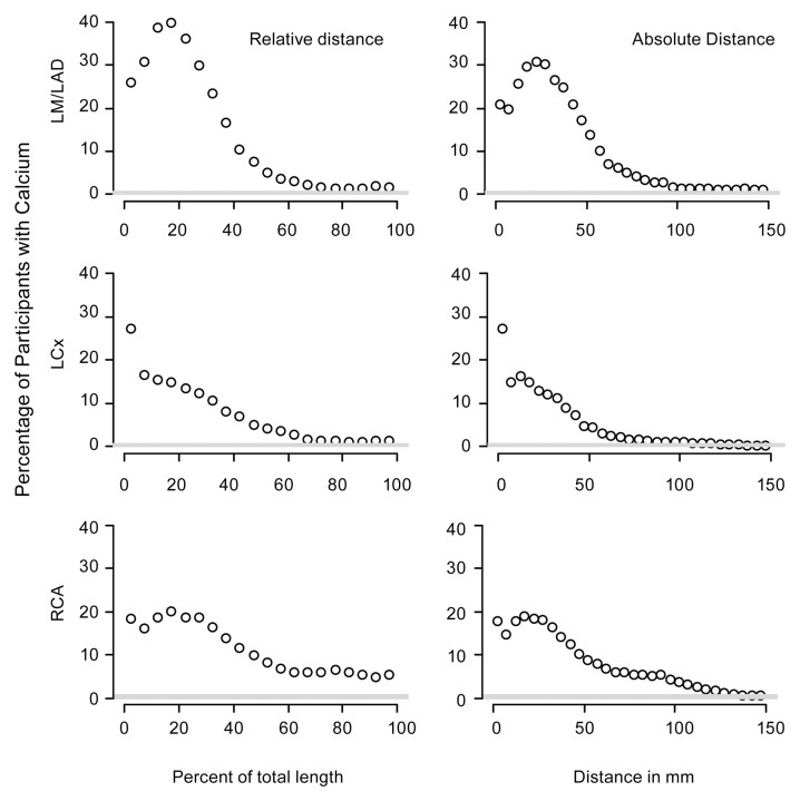
Figure 1:
Graphs show the prevalence of calcific plaque along the arteries. Graphs in the left column represent relative distance, with each point representing the fraction of subjects who have calcium within an interval representing one-twentieth of the total length of the artery. Graphs in the right column represent absolute distance, with each point representing the fraction of subjects who have calcific plaque within 5-mm intervals along the artery.

