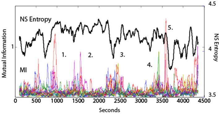
Figure 5.
Dynamical comparisons of NSH and MI. The NSH was averaged across all frequencies and all sensors, and the MI values were averaged across the fourteen dyad pairs shown by the colored lines. The numbers represent performance events surrounding those time periods. (1) The team was having difficulty remembering the sequence of buoys to use when establishing the ship's position. (2) The team was preparing for a turn into difficult waters with other ship traffic. (3) A simulation “Pause” was called by the Assistant Navigator to express his concerns with the team. (4) A Man Overboard event. (5) Beginning of the Debriefing segment.

