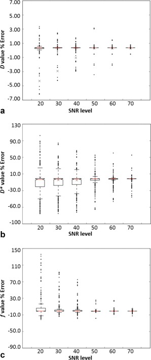
Figure 5.

Boxplots for IVIM‐D (a), IVIM‐D* (b), and IVIM‐f (c) derived using the one‐parameter fitting with the gray matter model at increasing SNR levels, with the y‐axis describing the error to the true value. The crosses are the means, the central lines (red) are the medians, and the notches describe the 95% confidence levels in the median. The box edges are the first (Q1) and the third (Q3) data quartiles, with whiskers showing the more extreme data points not considered outliers.
