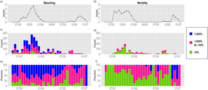
Fig 1. Temporal distribution of observations.
Figures on the left column refer to bleaching, and those on the right refer to mortality. Fig 1A and 1B show the average DHW in the observed locations for the region of analysis between May 2005 and January 2007. Fig 1C and 1D show the number of observations, x, with 0%, 0% < x < 30%, or x >30% bleaching or mortality. Since the number of observed sites varies over time, in Fig 1E and 1F we show the share of observations in each distribution bin over time. The left and right panels for DHW, Fig 1A and 1B, differ because the observations available for mortality are a subset of those available for bleaching.

