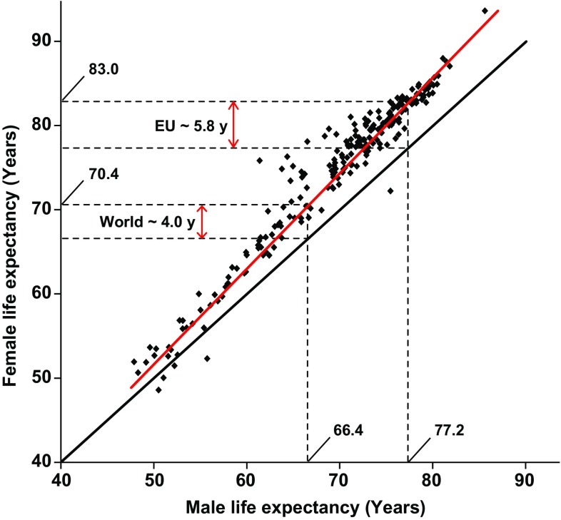
Fig. 1.
Men live on average shorter lives compared to women. Each dot shows data from one nation or human population. The red line represents the observed difference in lifespan and the black line represents a null hypothesis with no difference in longevity between the sexes. The dotted lines mark the male and female life expectancies globally and in the European Union (EU). Data from The World Factbook 2013 on male and female life expectancy at birth in different human populations in 2013 (https://www.cia.gov/library/publications/the-world-factbook/)

