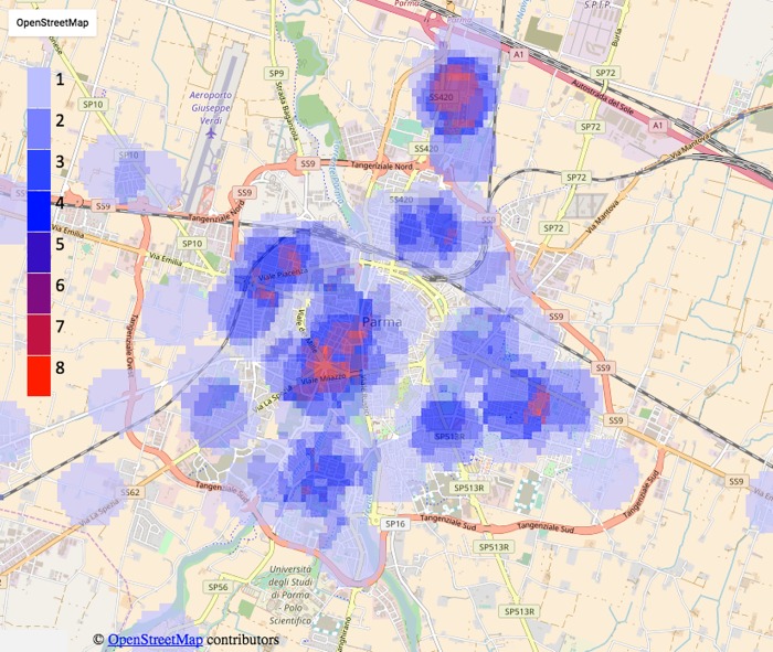
Fig 4. Heat map of distribution of sarcoidosis cases the Parma area.
The color-scale from low blue (equal to 1) to red (equal to 8) displays the number of patients resident within a range of 500 meters from each considered point on the map of the area under study. Data from OpenStreetMap visualisation.

