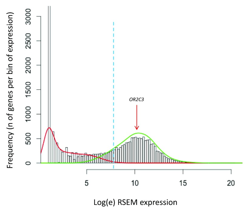
Figure 3. Distribution of gene expression in a representative melanoma sample.
Histogram representing the frequency (Y axis) of genes expressed per bin of gene expression (X axis: expression levels are shown as [log e(RSEM+1)+1], see Methods, RSEM values from TCGA repository) for a representative melanoma tumour (TCGA.D9.A4Z6.06A.12R.A266.07). The green and the red lines represent the modelling of the 2 peaks of the bimodal distribution. The dashed blue line shows the threshold of expression above which genes have the probability >95% of belonging to the distribution of the expressed genes (right distribution in green).

