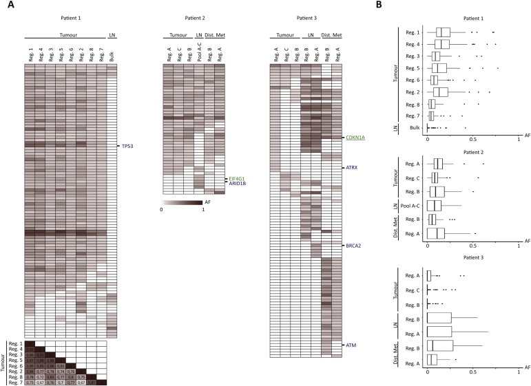
Figure 4.

Distribution of allele frequencies across all samples. (A) Heat maps of allele frequencies ranging from 0 (white) to 1 (dark red) (including tiers 0–1 mutations, called with a category score of 1 or 2 in at least one of the samples). We further excluded mutations where we did not reach 30 total reads in the given position for all samples. Known tumour suppressor genes and IntOGen driver genes are annotated in blue and green, respectively. No oncogenes were left after filtering. For patient 1, a correlation matrix of r scores is shown for the 8 primary tumour regions for comparison of the individual samples. (B) Boxplots summarising the distribution of the allele frequencies for the given samples after exclusion of mutations with less than 30 total reads. Samples are ordered in descending number of mutations within primary tumour, lymph node metastasis, and distant metastasis in each patient. AF: Allele frequency. Reg.: Region, LN: Lymph node metastasis, Bulk: Exome on bulk DNA, Pool A–C: Pool of exomes, Dist. Met: Distant metastasis.
