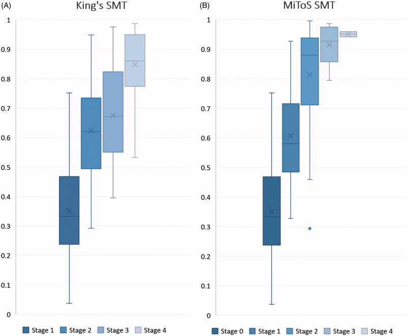
Figure 2.
Box plot for Standardised Median Time (SMT) from onset to each disease stage. (A) SMT for King’s stages. (B) SMT for MiToS stages. The y-axis represents the proportion of disease time elapsed, where 0 is disease onset and 1 is death. Horizontal lines on each plot represent the following: minimum, lower quartile, median, upper quartile and maximum values, read from bottom to top. Mean values are marked by ‘x’ and outliers by ‘•’.

