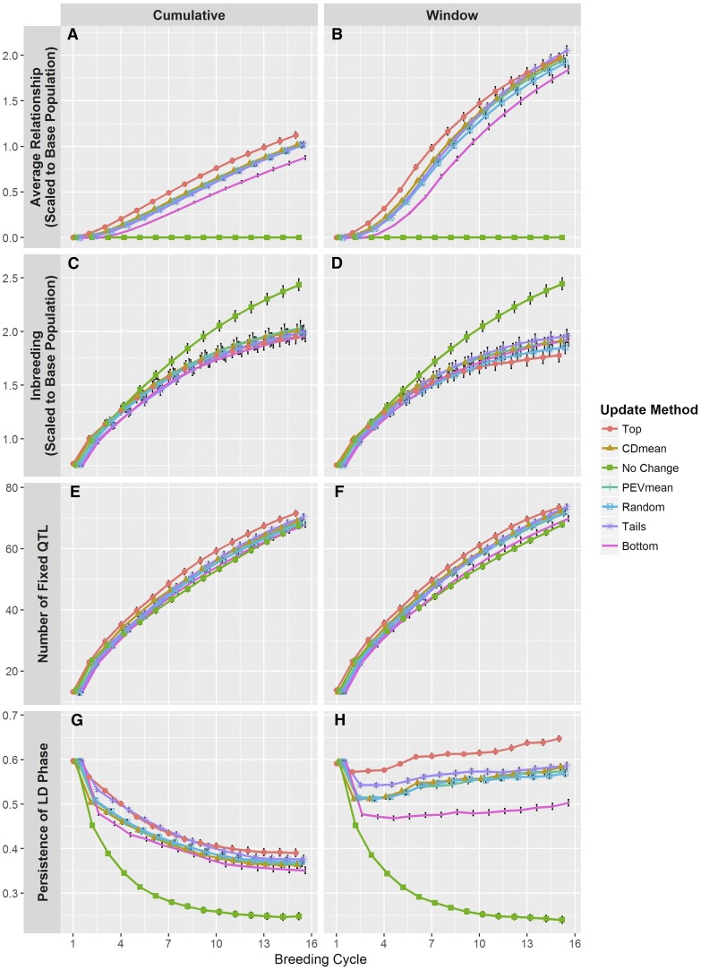
Figure 5.
Other variables tracked over the course of the simulations. (A and B) The average genomic relationship was calculated between the training population and the selection candidates using marker genotypes. Relationships were scaled to reflect the allele frequencies in the base population. (C and D) The level of inbreeding was measured on the selection candidates and was derived from the relationship matrix described above. (E and F) The number of QTL fixed for an allele was measured in the selection candidates. (G and H) Persistence of LD phase was measured as the correlation of r between the training population and the selection candidates. Line colors and point shapes delineate the different methods of updating the training population. Plots are separated into the (A, C, E, and G) Cumulative and (B, D, F, and H) Window updating scenarios. Average values are shown with 95% confidence intervals. To help reduce plot clutter, points for each update method are given a small, consistent jitter along the x-axis.

