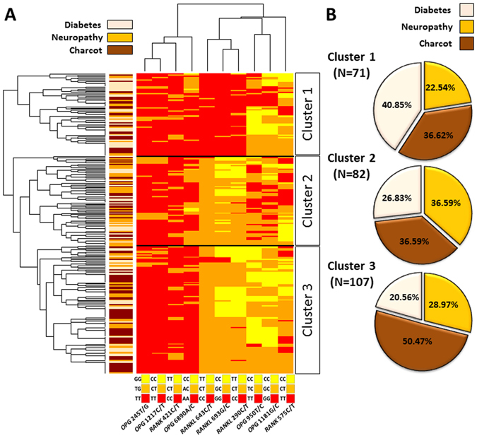
Figure 4.

Hierarchical clustering of SNPs in OPG, RANKL and RANK genes. (A) Distribution of SNPs in selected genes is shown as a heat map where colors correspond to homozygote or heterozygote, accordingly to the legend for each SNP (below the heat map). Row dendrogram shows patient SNP profile clusters and column dendrogram shows distribution pattern of selected SNPs across all patients. Side bar color corresponds to a group according to the legend above the bar. 260 patients have been divided into three clusters according to the similarities in their SNPs’ profiles. (B) Percentage of patients diagnosed with diabetes, neuropathy or Charcot arthropathy in the corresponding clusters. The legend is shown above the pie charts. Numbers in brackets below the percentage show the number of patients from each cluster.
