
Figure 4.
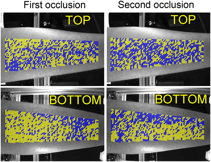
Mapping of the good ROIs distribution. Images in the left column calculated during the first occlusion whereas those in the right column are in the second occlusion that started 10 s later the cuff was deflated. Yellow and blue squares show ROIs with the linear and distorted PPG waveforms, respectively.