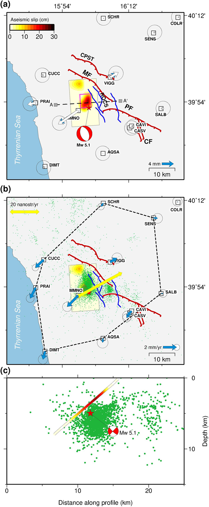
Figure 4.

Surface deformation during the transient aseismic event and interseismic velocity field. (a) Observed (blue arrows) and predicted (white arrows) cumulative horizontal displacements from the aseismic model. The purple box represents the best-fit uniform slip aseismic fault plane, while the colour scale is the aseismic slip distribution (in mm) of the total cumulative displacement computed on an extended fault plane discretized into smaller patches. (b) Best-fit interseismic horizontal velocity field in an Apulian (Ap) reference frame. The dashed lines enclose the polygon used for strain rate calculation, while the double sided arrows indicate the principal strain rates ( = 34 ± 7 × 10⁻⁹ yr−1). Green dots represent the relocated54 seismic events during the swarm. Traces of active faults as in Fig. 1. (c) Estimated aseismic slip distribution as a function of depth (symbols as in panel c). The hypocentre of the largest shock (M W 5.1) is shown as a red star and the mechanism of this event is taken from time domain moment tensor (TDMT) catalogue. The maps were created by using Generic Mapping Tools software (GMT v4.5.14; http://gmt.soest.hawaii.edu/)53.
