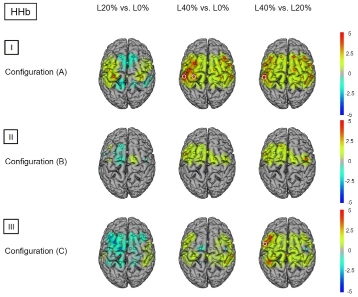
Figure 3.
HHb t statistics for fNIRS configurations (A, B) and (C). Channels (centered between transmitters and detectors) are shown for each image. Decreases in HbO2 responses are illustrated in dark blue, increases in HbO2 responses are illustrated in dark red. The entire range is illustrated in the attached legend. Significant channels are marked with white circles. (I) Areas that are significantly more active for BS at L20% vs. L0%, L40% vs. L0% and L40% vs. L20% for configuration (A). All images are thresholded at p < 0.0023. (II) Areas that are significantly more active for BS at L20% vs. L0%, L40% vs. L0% and L40% vs. L20% for configuration (B). All images are thresholded at p < 0.0038. (III) Areas that are significantly more active for BS L20% vs. L0%, L40% vs. L0% and L40% vs. L20% for configuration (C). All images are thresholded at p < 0.0023.

