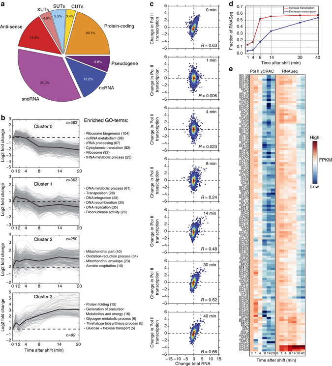
Fig. 4.

RNA polymerase II χCRAC shows rapid changes in Pol II transcription during glucose deprivation. a The pie chart shows what percentage of each RNA class showed changes in Pol II transcription during glucose deprivation. b Pol II cross-linking profiles for protein-coding genes were generated by K-means clustering, performed using STEM60. Only mRNA profiles were selected that showed a maximum fold-change of at least 1.5 and had a mean pairwise correlation over two biological replicates of 0.7. The gray lines indicate profiles from individual genes. The dark black lines show the average profile for each cluster. Enriched gene ontology (GO) terms are indicated on the right side of each graph. The y-axis shows the log2-fold change of each time-point relative to time-point 0 (glucose sample). The x-axis shows the time-points that were analyzed (minutes) during the glucose starvation time-course. c Comparison of changes in Pol II transcription (y-axis) to changes in total RNA levels (x-axis) for several time-points. Red and blue colored dots indicate high and low data point density, respectively. To compare the data sets, we Z-normalized the fragments per kilobase transcript per million reads (FPKM) values. R-values indicate Pearson correlations. d RNA degradation is a rate limiting step during the glucose deprivation response. For each time-point, we calculated what fraction of genes that showed an increase or decrease in transcription (>=2-fold) also showed a similar change in the RNASeq data (y-axis). The x-axis shows the time-points (minutes) after induction of glucose starvation that were analyzed. The red line shows the results for the transcriptionally upregulated genes. The blue line shows the results for transcriptionally downregulated genes. e Transcription of most r-protein genes is shut down within 4–8 min, but total RNA levels only decrease many minutes later. The x-axis shows the time-points (minutes) after induction of glucose starvation that were analyzed. The heat map shows a side-by-side comparison of Pol II χCRAC and RNASeq r-protein data from a glucose starvation time-course. The higher the FPKM, the redder the color. The lower the FPKM the darker blue the color. Note that the RNASeq data has two longer time-points (30 and 40 min)
