
FIGURE 6.
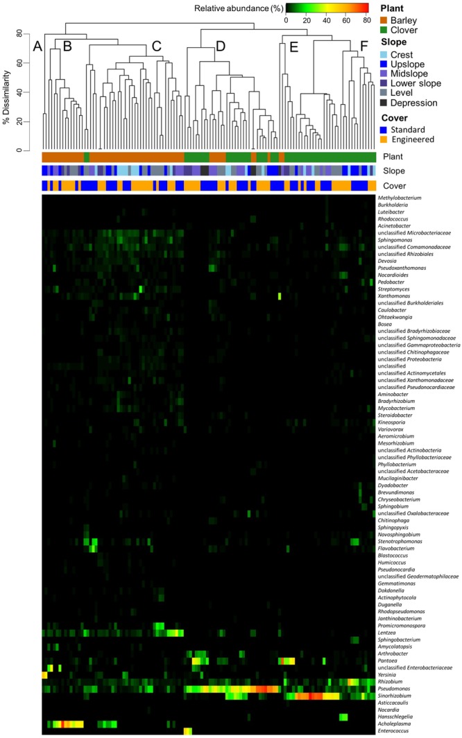
Heatmap based on relative abundance of sweet clover and barley associated endophytic communities. Vertical columns represent samples; horizontal rows represent genera that are 2% most abundant in at least one sample. Clustering of samples (top) is based on genera co-occurrence by Bray–Curtis dissimilarity. Letters (A–F) indicate different clusters at a 70% dissimilarity cut off.