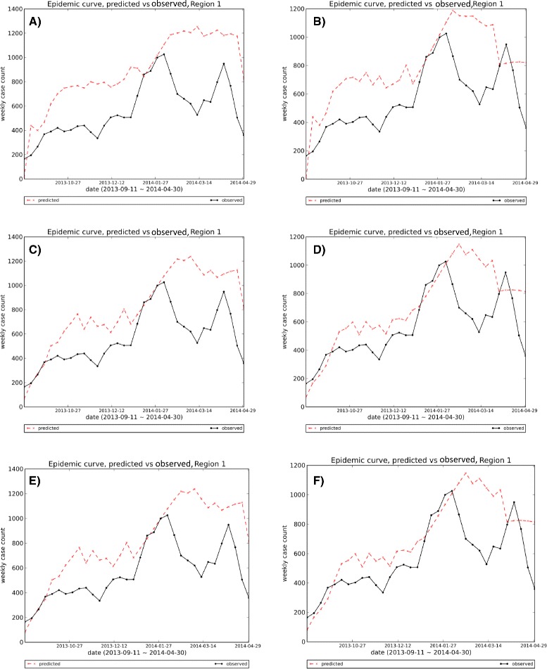
Fig. 17.

Visual comparison of 1-step-ahead predicted curves generated by six methods vs. the observed curve, Region 1: The first and second methods show bigger deviations from observed curve, especially in the first half of the season. As the six methods are different configurations of one algorithm, their outputs are so competitive and sometimes similar to each other; methods 3 and 5, and methods 4 and 6 show some similarity in their one-step-ahead epidemic curve that is consistent with Horizon Ranking charts for various Epi-features
