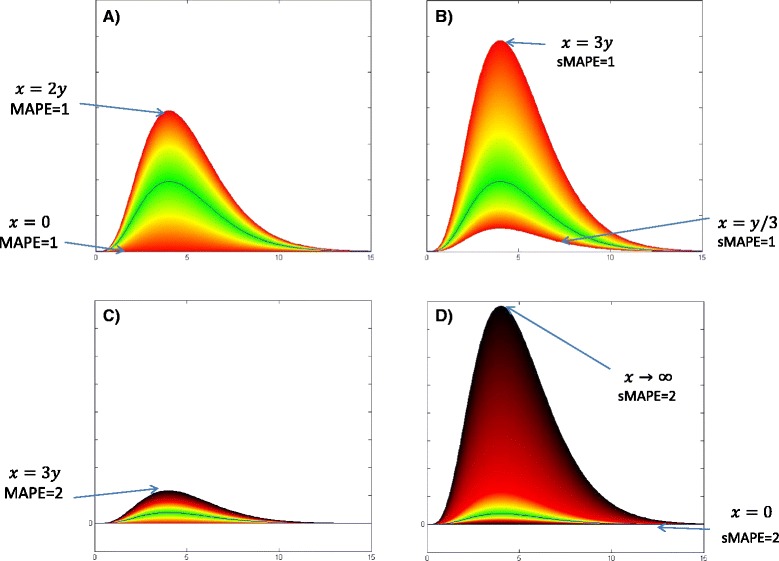
Fig. 18.

Comparison of MAPE and sMAPE domains and ranges spectrum: Red borders in the left graph (a) belong to predicted curves x(t)=2×y(t) and x(t)=0×y(t) with MAPE = 1 and the red borders in the right chart (b) corresponds to x(t)=3×y(t) and x(t)=(1/3)×y(t) which generate sMAPE = 1. The black borders in graphs c & d are corresponding to predicted epidemic curves which generates MAPE=2 and sMAPE =2 in the left and right charts sequentially
