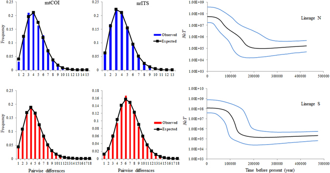
Figure 3.

Mismatch distributions and Bayesian skyline plots for each genetic lineage. In mismatch distributions, bars represent the observed frequency of pairwise differences, whereas the solid lines show the expected values under the sudden expansion model. The BSPs show N e T (N e = effective population size; T = generation time) changes through time. Black lines represent median estimates while the blue lines show the 95% highest posterior density (HPD) limits.
