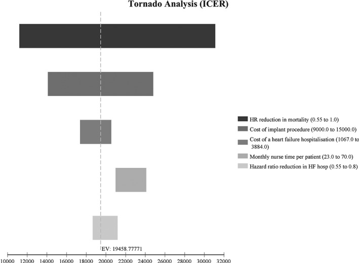
Figure 4.

One‐way sensitivity analysis. The results of the sensitivity analysis can be compared in this tornado diagram; a larger bar indicates a greater impact on the incremental cost‐effectiveness ratio (ICER) or, in the case of mortality, indicates a wide range of uncertainty. The dotted line indicates the base case ICER. In the case of increased heart failure (HF) hospitalization costs the ICER is lower. HR, hazard ratio.
