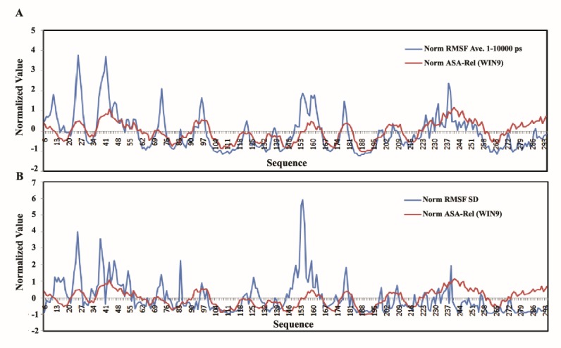
Figure 6 .

Correlation between RMSF-SD and ASA in hCDK2 in comparison with average RMSFs v.s. ASA; in panel A, Red curve is for win-9 normalized relative ASA and the blue one is for normalized RMSF average at 1-10000 ps. In panel B, red curve illustrates the normalized relative ASA calculated by using sliding window method as long as nine character and the blue curve is for the normalized RMSF-SD
