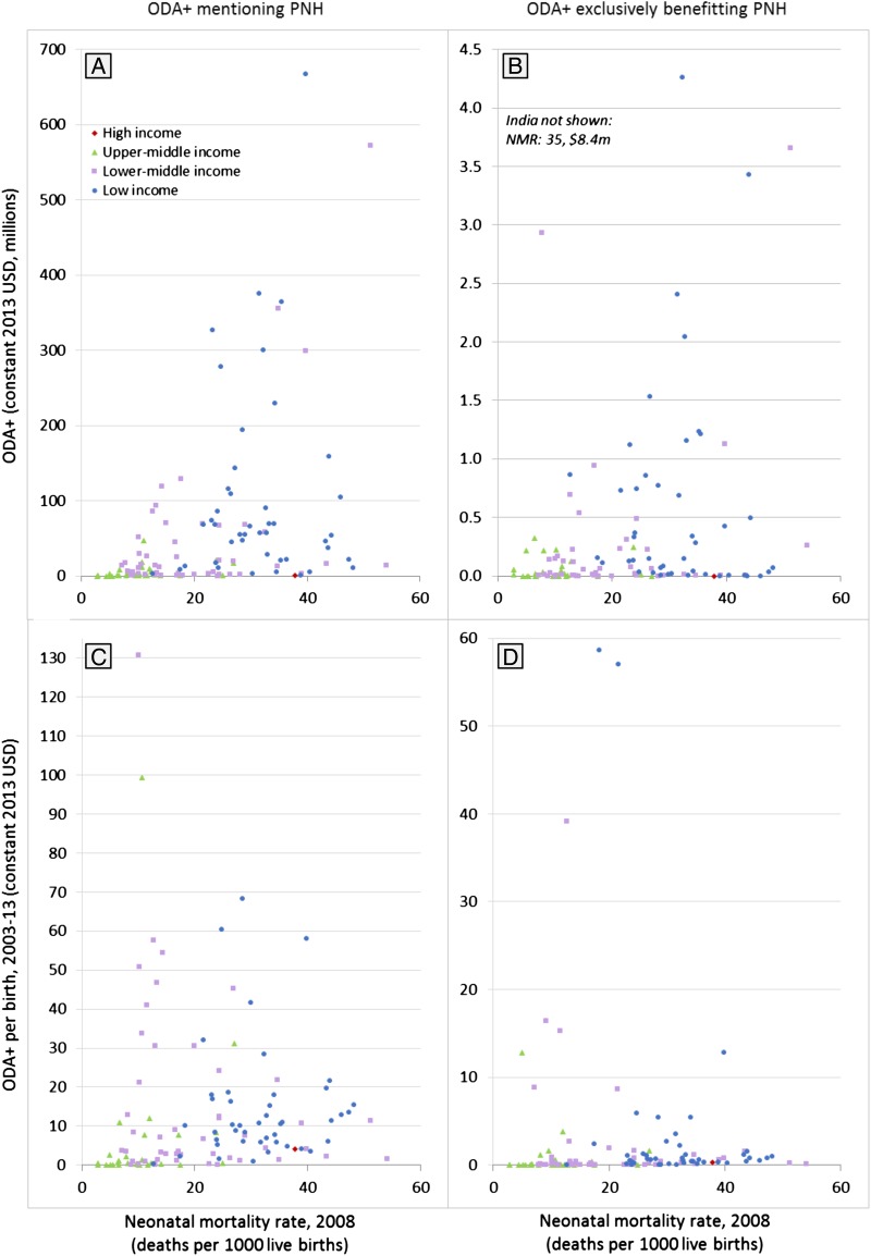
Figure 3.
Targeting of ODA+ mentioning prenatal and neonatal health (PNH) to countries with the greatest need, 2003–2013. The four scatter plots present the association between the amount of official development assistance and private grants (ODA+) received by each country and the neonatal mortality rate (our metric of health needs) in that country. Data points are colour-coded by country income group to provide an indication of their economic need. The four scatter plots show total funding over the 11-year period (plots A and B) and average ODA+ per birth (plots C and D) that mentions PNH (plots A and C) and that exclusively benefits PNH (plots B and D).

