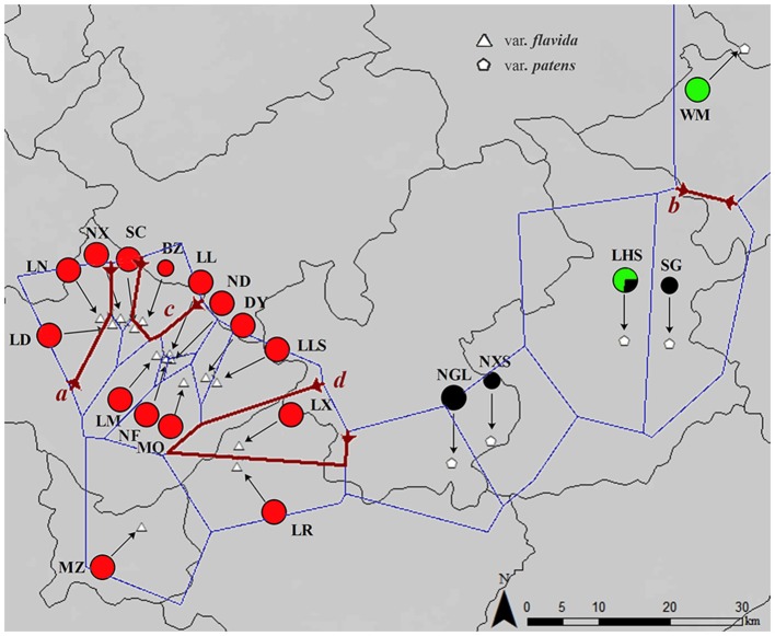
Figure 1.
Map of the sampling location and results of the barrier analyses. The colors of the populations represent the cpDNA haplotype lineages as identified by phylogenetic analyses. The first four barriers a, b, c, and d defined by the Monmonier algorithm of the PAL datasets are represented by dark red lines.

