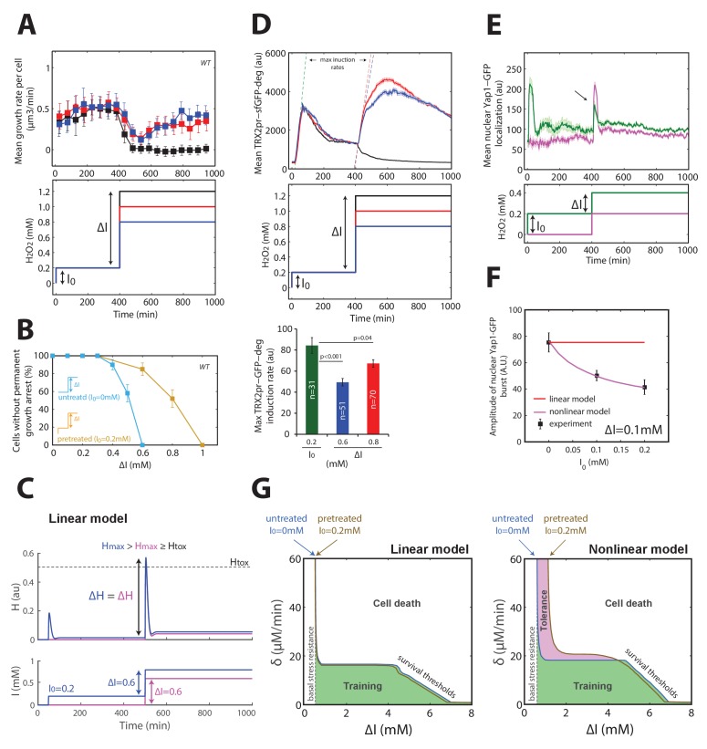
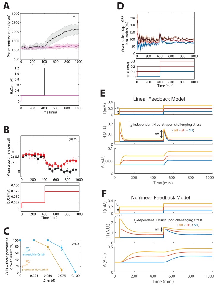
Figure 4. Mechanism of acquisition of tolerance to stress.
(A) Mean cell growth rate (top panel) of cells exposed to H2O2 steps of the magnitude indicated in the bottom panel at t = 400 min after a 0.2 mM pretreatment at t = 0 min. (B) Fraction of cells without permanent growth arrest at different concentrations of H2O2 in the presence (yellow) or absence (blue) of pretreatment. N = 100 for each concentration. (C) Response of the linear system to simple H2O2 step of amplitude ΔI = 0.6 mM for naive (magenta: I0 = 0 mM) or pretreated (bleu: I0 = 0.2 mM) cells. (D) Top: Mean cell transcriptional dynamics (top panel) of the TRX2 promoter (Trx2-sfGFP-degron) for the H2O2 treatments shown in the middle panel. Bottom: Quantification of the maximum transcription rate of the TRX2 promoter during the indicated steps. Two-means Z test. (E) Mean cell Yap1-GFP nuclear localization upon a 0.2 mM H2O2 step for cells with (green line) or without (magenta line) a 0.2 mM pretreatment, as indicated in the bottom panel. (F) Quantification of the amplitude of the burst in Yap1 nuclear localization during a 0.1 mM H2O2 challenge step. The lines indicate the fit of the linear (red) and nonlinear (magenta) models. (G) Numerical phase diagram indicating the region in which adaptation is permitted as a function of the overall stress magnitude ΔI and stress rate δ for the linear (left) and nonlinear (right) models. The solid black line indicates the contour given when Hmax = Htox (survival threshold) as in Figure 3C. The vertical dashed line represents the basal stress resistance, as observed in step experiments. The green color represents the region in which cells can be trained to resist higher stress levels through a slow ramping process. The magenta region highlights the shift in survival threshold obtained following a pretreatment according to the nonlinear model. A, D–F, error bars and shaded regions are SEM (N > 100 for most time points). B, error bars are 95% CI. See also Figure 4—figure supplement 1.


