
Figure 3. Graphical visualization abundance distribution of spots 471, 683 and 684 in rectal tumor (T) and healthy normal tissue (N) tissues.
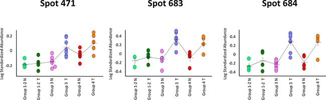
The three differential spots increased in content in poor responders (‘TRG 3′ and ‘TRG 4′) versus good responders (‘TRG 1-2′), and had a higher content in cancer tissues than the healthy normal ones. In each graph, a single circle represents the Log standardized abundance of the spot calculated for one gel/patient.