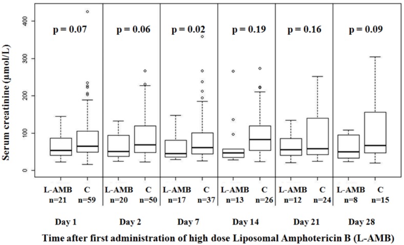
Fig 2. Box plots representing serum creatinine in patients receiving high-dose L-AmB and 59 matched controls.
This figure shows six couples of boxplots, one couple for each visit days of follow up. The X axis shows the visit days of follow up (Day 1, Day 2, Day 7, Day 14, Day 21, and Day 28) and the Y axis the measured values of serum creatinine (μmol/L). The shaded box indicates the middle 50% of the data; the lower and upper ends of this box therefore indicate the 25th and 75th percentiles, respectively. The solid black horizontal line through each shaded box indicates the median of the distribution and the black cross the mean. The circles above the vertical solid black lines are individual outliers. P values are provided above each pair of combinations.

