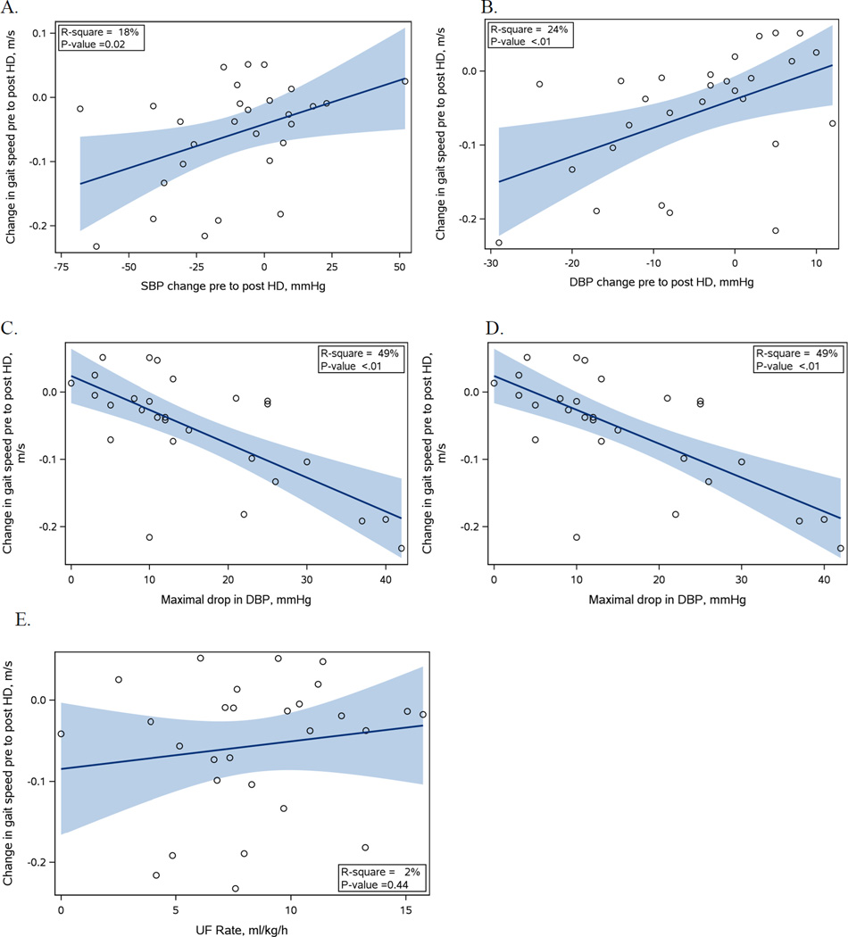
Figure 2.
Graphs of blood pressure and ultrafiltration variables (shown on x-axis) and change in gait speed (shown on y-axis)
Graphs A and B show the change in SBP (A) and DBP (B) from pre to post HD. A negative number indicates that the BP decreased from pre to post HD. Graphs C and D show the maximum drop in SBP (C) and DBP (D) during the HD session. Graph E shows the UFR for the HD session. For each graph the regression line is shown in a solid line and the shaded area represents the 95% CI.

