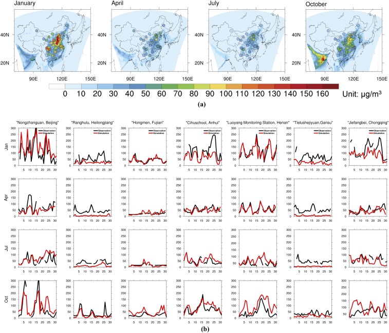
Fig. S4.
(A) Comparison of observed (dots) and simulated (map) 2015 monthly mean PM2.5 concentrations in each province of mainland China. Identical color scales are used for observed and simulated concentrations. Monitoring sites are chosen when less than 6 d of data are missing per month. (B) Comparison of observed (black) and simulated (red) 2015 daily mean PM2.5 concentrations in China’s seven regions. One province (the first name in the alphabet from the region) from each region is presented. Daily average concentrations are calculated when there are less than 6 h of data missing each day (otherwise data are reported as NA). Detailed site information is shown in Table S3.

