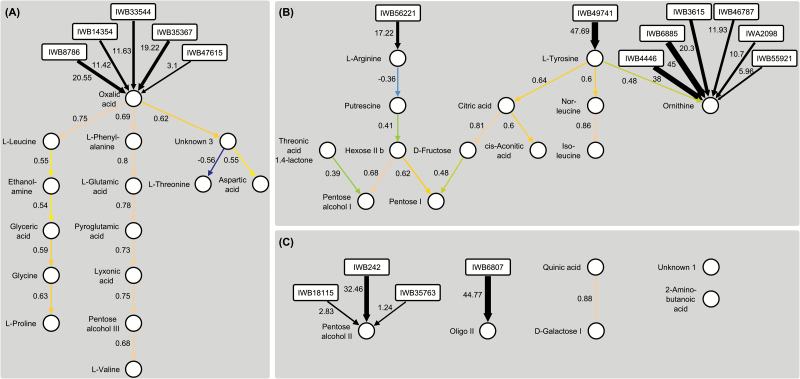
Fig. 6.
Partially directed network graphs describing the causal relationships among the 34 metabolites showing a significant genotypic variance (P < 0.05). The QPSO algorithm inferred two directed clusters (A) and (B) as well as some unrelated metabolites (C). SNP nodes are represented by rectangles and the proportion (%) of the explained genetic variance is both given as a number and indicated by the thickness of the connecting arrows. Metabolite nodes are represented by circles and correlations are displayed both numerically and graphically by coloured arrows (the colours correspond to the heat map in Fig. 3). High positive correlations are represented in earth tones and negative ones in blue.

