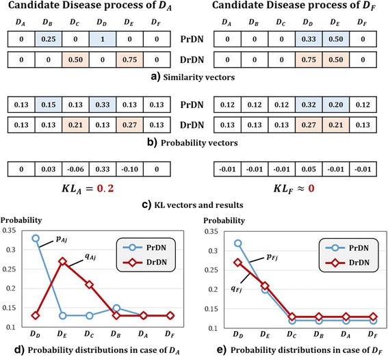
Fig. 3.

Toy example of Candidate Disease Prioritization. By comparing D A and D F, figures show results of candidate disease prioritization by step-by-step. a expresses similarity vector for edges where D A and D F are connected to other diseases in PrDN and DrDN. b is a probability of similarity from a through pre-processing. c is KL value that is calculated between two diseases according to formula. KL A is 0.2 and bigger than KL F that is near 0. Therefore, intuitive decision for priority is digitized, we can see that same results are appearing. d and e are graphs which express probability distributions for two diseases in b. These graphs display such distribution by order of bigger values. The reason for big difference in KL value is evident by comparing d and e
