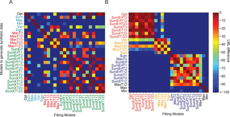
Figure A1. Model recovery analysis.

We tested how well synthetic data sets generated from each model (rows) were fitted by each model (columns). (A) Model confusion matrix. The color in a cell represents the difference in log marginal likelihood between a model and the winning model for the corresponding data set. Dark red on the diagonal means that the model used to generate the data was found to be most likely. (B) As in (A), but with models clustered by Agreement. Models in red are models with high Agreement to the Opt model. Models in blue are from a different model set with low Agreement to the Opt model, but similar to each other. Models in orange have higher Agreement to the Opt than to the blues models, but they are still well distinguishable from the Opt model. Also refer to Fig. 8C.
