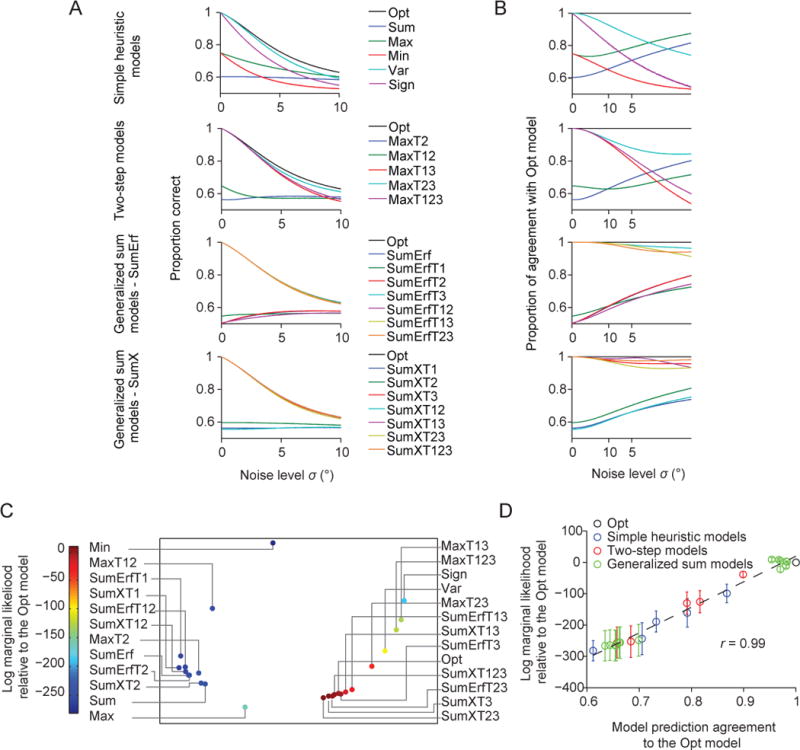
Figure 8. Model similarity and goodness of fit.

(A) Proportion correct as a function of the noise level σ for all models. (B) Proportion of trials for which a model makes the same prediction as the Opt model, as a function of σ. (C) Averaged prediction agreement (“Agreement”) visualized using multi-dimensional scaling. Each dot represents a model, and the distance between two models represents the disagreement between those models. The color of a dot represents its log marginal likelihood. Models that agree more with the Opt model tend to have a higher log marginal likelihood. (D) Mean (open circle) and s.e.m. (error bar) across subjects of a model’s log marginal likelihood as a function of its Agreement with the Opt model. Each dot indicates a model. The solid line represents the best linear fit. r is the Pearson correlation.
