
Figure A3. Correlation between log marginal likelihood and Agreement with any one model given the real data.
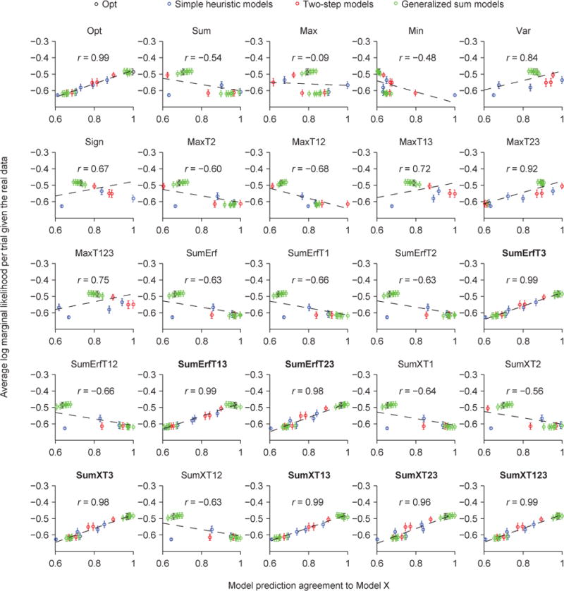
Related to Fig. 8D and Fig. 9A. Each plot shows, given the real data, the mean (open circle) and s.e.m. (error bar) across subjects of a model’s average log marginal likelihood per trial as a function of its Agreement with a reference model; the reference model differs between plots. The dashed line represents the best linear fit. r is the Pearson correlation. The names of eight best models are in boldface.