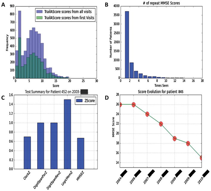
FIGURE 4.
Example of visualizations produced through a combination of PyCap and Python plotting functions. Notice data can be visualized at a population level (A,B) as well as at a patient level (C,D) for visualizing patient evolution over follow up visits. Patient IDs have been randomly generated and exact dates blocked out to maintain confidentiality.

