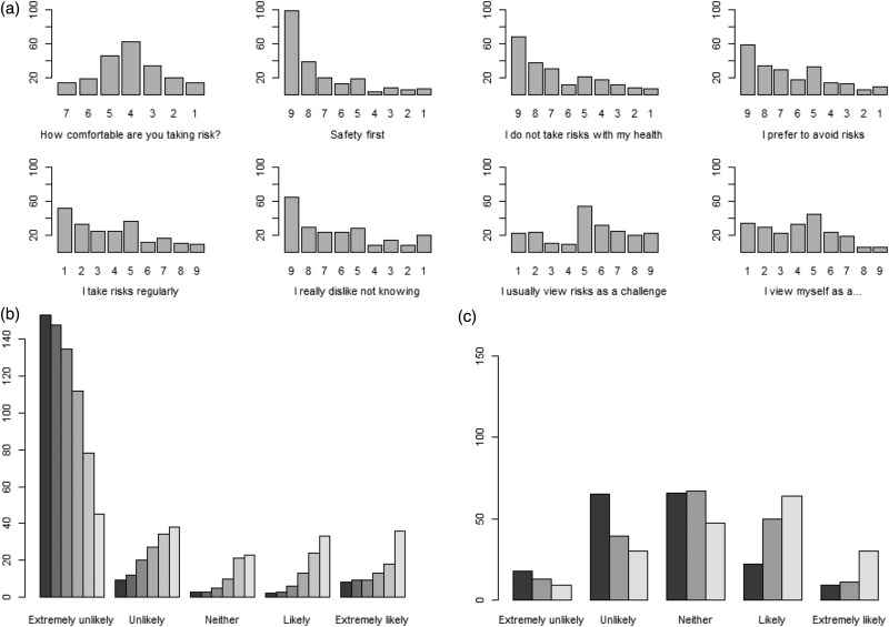
Figure 1.
Descriptive graphics for risk attitude and risk perceptions.
(a) Bar graph showing the frequency of each response level for risk-attitude questions. Each graph is oriented so that higher risk seeking is shown on the right of the graph, but the actual scores are listed on the x-axis. (b) Bar graph for likelihood of taking a medication with a fatal side effect. The six bars from left to right show a probability of a fatal side effect of 1 in 2, 1 in 10, 1 in 100, 1 in 1000, 1 in 10,000, and 1 in 100,000, respectively. Only participants who answered all six questions were included in the graph (n = 175) to allow direct comparison. (c) Bar graph for the likelihood of disease worsening. The three bars from left to right show a likelihood of disease worsening in two years, five years and 10 years, respectively. Only participants who answered all three questions were included in the graph (n = 180) to allow direct comparison.

